Wednesday, April 22, 2009

Sketching for Illustration (Kato Paintings)

It turns out that in Sketching for Illustration you don't do as much sketching as you do painting. Here are some paintings from the class.

HW: paint a billion t-shirts ignoring the shadow side

An in-class painting where I actually got paint to cover just about the entire canvas. This is not done, so don't judge too harshly.

Kato's midterm: a practical joke still life. My joke is your keys in the jello. It promptly fell apart right after I painted it.

Kato's final: a crime scene. My scene is of a murder.
Garbage bags containing dead chopped up bodies, a shovel in the back and a Clorox spray bottle for clean up.

Charcoal Drawings with a Clunky Eraser

Torture. Pure and utter torture. I hate being dirty and this exercise gives you black buggers for weeks. Not to mention it gets all over anything you touch and makes you look like a chimney sweeper. Still, the point was to get dirty and to let go. After all, you're using a paper towel with charcoal dust to get the gestural shape of the figure. Then going back in with a pencil to get some more detail. Finally, you're using a big fat Steadler eraser to create form. The trick is to hard edges vs. soft edges.


So after class ended, I asked my teacher, Bob Kato, if there was a cleaner way to re-create this exercise. Because in all honesty, they are some of my best drawings from school so far. He said yes: Photoshop. Give it a try!

Drawing for Illustration- Take 2

In-class drawing where we were just getting into exaggeration. Originally, I made her hair just a little big, but then went way more. I tried drawing her face (I hate drawing faces) and made her cross-eyed by accident. Thus she has a fly on her nose so it isn't as weird.

I was told that in class, we were gonna get to draw siamese twins. I thought it would be like real Siamese twins. Nope, just two models in one big dress. It was hard to tell at first because you didn't wan to stare, but then you realize that they look nothing alike and you've drawn one of them in your last class.

I went kinda crazy for our last drawing. It was of a mermaid. Not sure if I like it or not.

Analytical Figure Drawings

These are the typical hw assignments for Analytical Figure Drawing. We copied statues and had to draw all the muscles underneath the figure, then label it all.

A foreshortened pose from class.

I did an auto adjust in photoshop and thought the brown paper made it kinda interesting.

Another in class Analytical Figure Drawing.
This is how my drawings looked without an auto adjust.

Dog Urn for Jake

For my final in my Materials of Art & Design class (essentially shop class), I created an urn for my dog. No, he's not dead yet. Kinda creepy and morbid, but I wanted him to have a nice resting place rather than be thrown in a ditch with all the other dogs. I feel that he deserves more than that. I even kinda cried in class about it during my final presentation. I didn't think it meant that much to me, but I guess the thought of my old dog dying got to me.


Front view of my dog urn. About 18" high.

Side view. About 8" wide.

The top is made from aluminum (from recycled cans).
The bottom is made from Honduran Mahogany.


This is what the inside of the base looks like.
It's a lot harder and more expensive to make than you'd think.

Friday, April 17, 2009

Ambidextrous

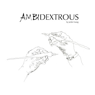
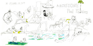
(Forward) I began this book as a study of left-handed vs. right-handed drawings. Originally, I wanted to become very sensitive to the types of lines and weights I was putting down. I thought that by drawing with my left hand (my non-dominant hand) it would force me to pay closer attention to the marks I was making. But I also had a major concern that the quality of my drawings done with my left hand might suffer. Instead, something amazing happened.

Drawing with my left hand gave me freedom to try new things and make mistakes. After all, I could always claim, “Well, it was done with my left hand. What did you expect?” And although the marks that my left hand made were shaky and sometimes uncontrollable, they were fresh and lively. When I stepped back from a drawing I would be surprised to see that a distorted face was still an easily recognizable face. I was even more shocked to find that sometimes a left-handed face was more interesting than a right-handed face.

When I returned to make right hand (dominant hand) drawings I used those left hand ‘mistakes’ as inspiration. Some of my right hand drawings clearly reflect those inspirations, sometimes to the point where it becomes hard to distinguish the difference between a right hand and a left hand drawing. So inside each drawing I have inserted an insignia to signify whether the drawings were done with my right hand or left hand or sometimes both. I hope you enjoy!

The following are excerpts from the book (total of 50 pages). It can also be purchased at http://www.blurb.com/bookstore/detail/677324


Expressive Type

My fancy Dr. Seuss inspired 'A'. My teacher didn't like it very much b/c the 'a' got lost. But it was still a cool drawing.


For one of our assignments, we had to create a logo for a restaurant. I choose this great place back in St. Louis called "Pastries of Denmark." I probably would have used a more script-like font but we were forced to design something that was more San Serif.

My final project for Expressive Type was to create a CD cover. I choose to do an emblem for the violinist, Vanessa Mae. Her music is based off classical stuff but with a modern twist (sometimes techno stuff and weird sound effects). So my emblem has just her initials with swashes to recall the look and feel of the violin scroll as well as a baroque feel.